[DAY 3] First Time Using CSS To Add An Animated Gradient Background To My Webpage
Today, I had a clear agenda for advancing my CSS skills and enhancing my webpage's aesthetics.
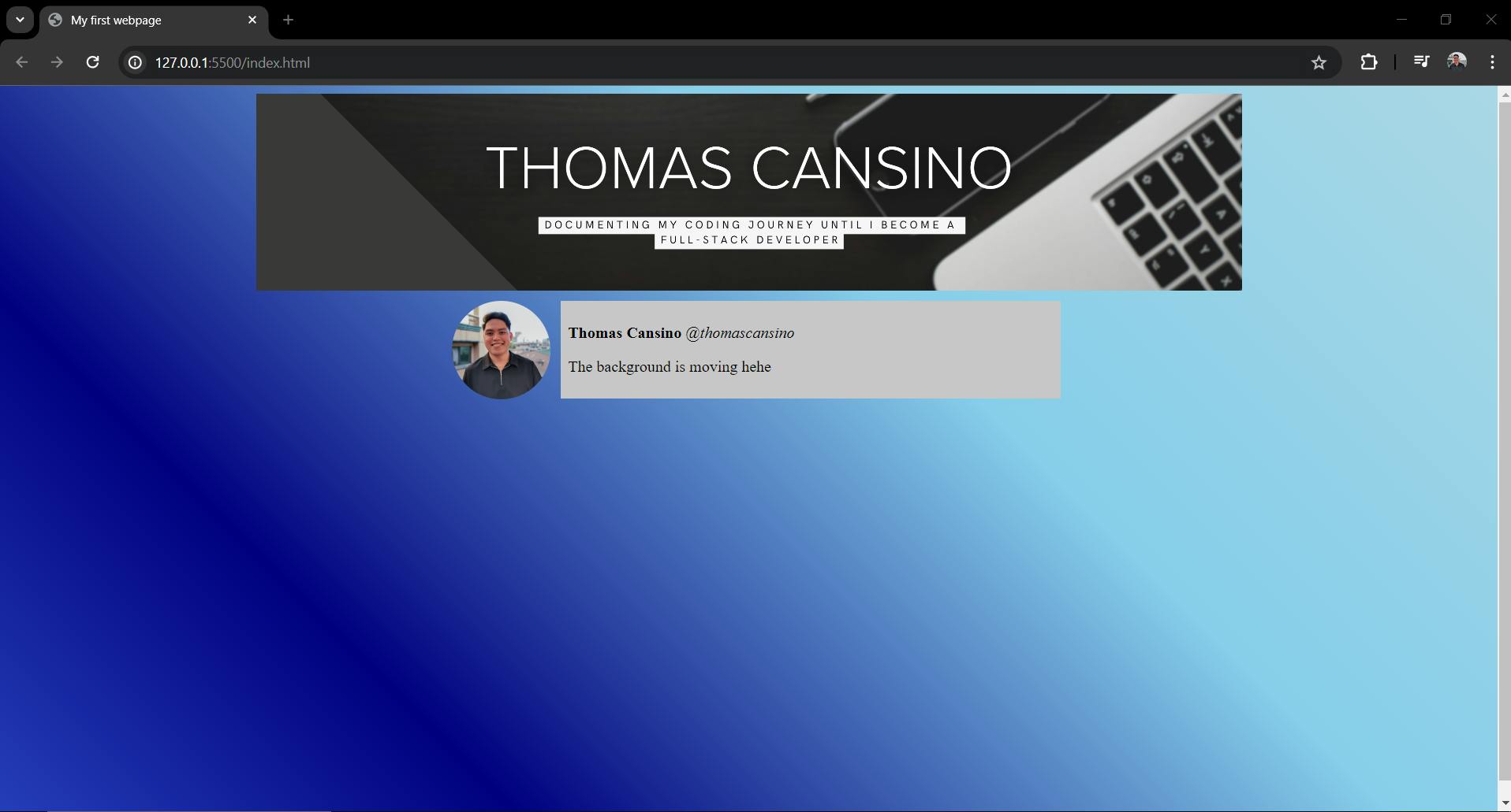
First on my list was cropping my banner to achieve the look that I want. Next, I aimed to introduce an animated gradient background for added flair, followed by incorporating rectangular shapes to encase my paragraphs.
However, the day was not without its challenges, I encountered difficulties in precisely cropping my images and in seamlessly integrating an animated gradient background. Additionally, creating rectangular backgrounds to encase my text elements proved to be a hurdle.
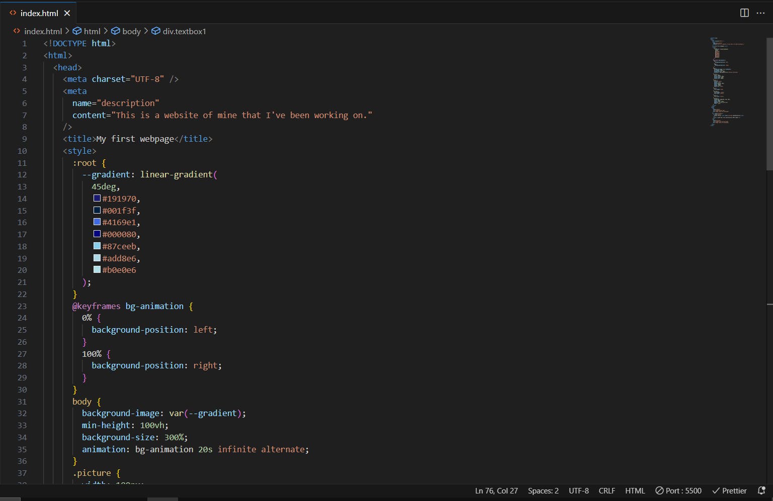
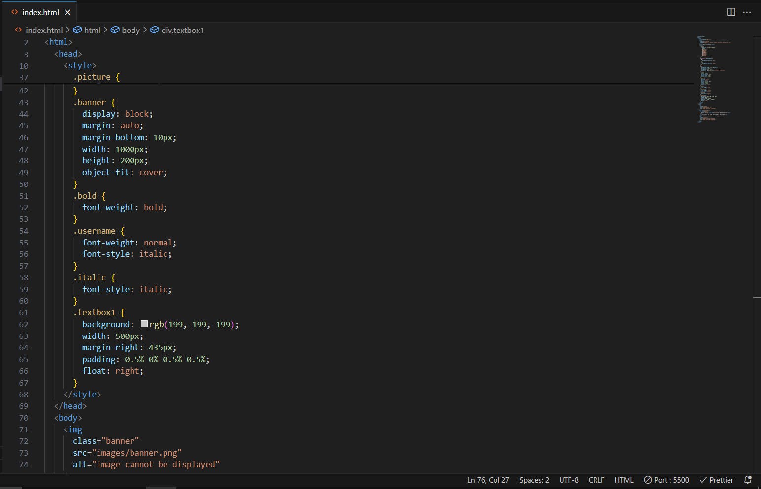
To overcome these obstacles, I delved into CSS techniques. I utilized properties like object-fit: cover and object-position: center to crop my images the way I want it to. For animated gradients, I used the @keyframes property and leveraged the :root property to utilize CSS variables, I named it, var gradients. I also experimented with 6-8 colors to create dynamic gradient effects that emphasize blue colors. Lastly, I used the background-image property in CSS to frame my text elements within colored background images for a visually appealing touch.


By day's end, while I managed to achieve the desired look for my website, I recognized there's still work to be done. The responsiveness across different browsers and screen sizes remains a challenge. On larger and smaller monitors, the layout collapses, highlighting the need for refinement.
Nonetheless, I'm content with the progress I made today. This hands-on approach has reinforced my learning process. I've discovered that I grasp concepts better when I’m actively building something using what I just learned and problem-solving along the way, rather than passively studying. The ability to immediately apply newly acquired knowledge is proving to be my most effective learning method.
As I look forward to tomorrow, I'm eager to tackle these remaining challenges and continue honing my skills as a developer.